Card
Overview
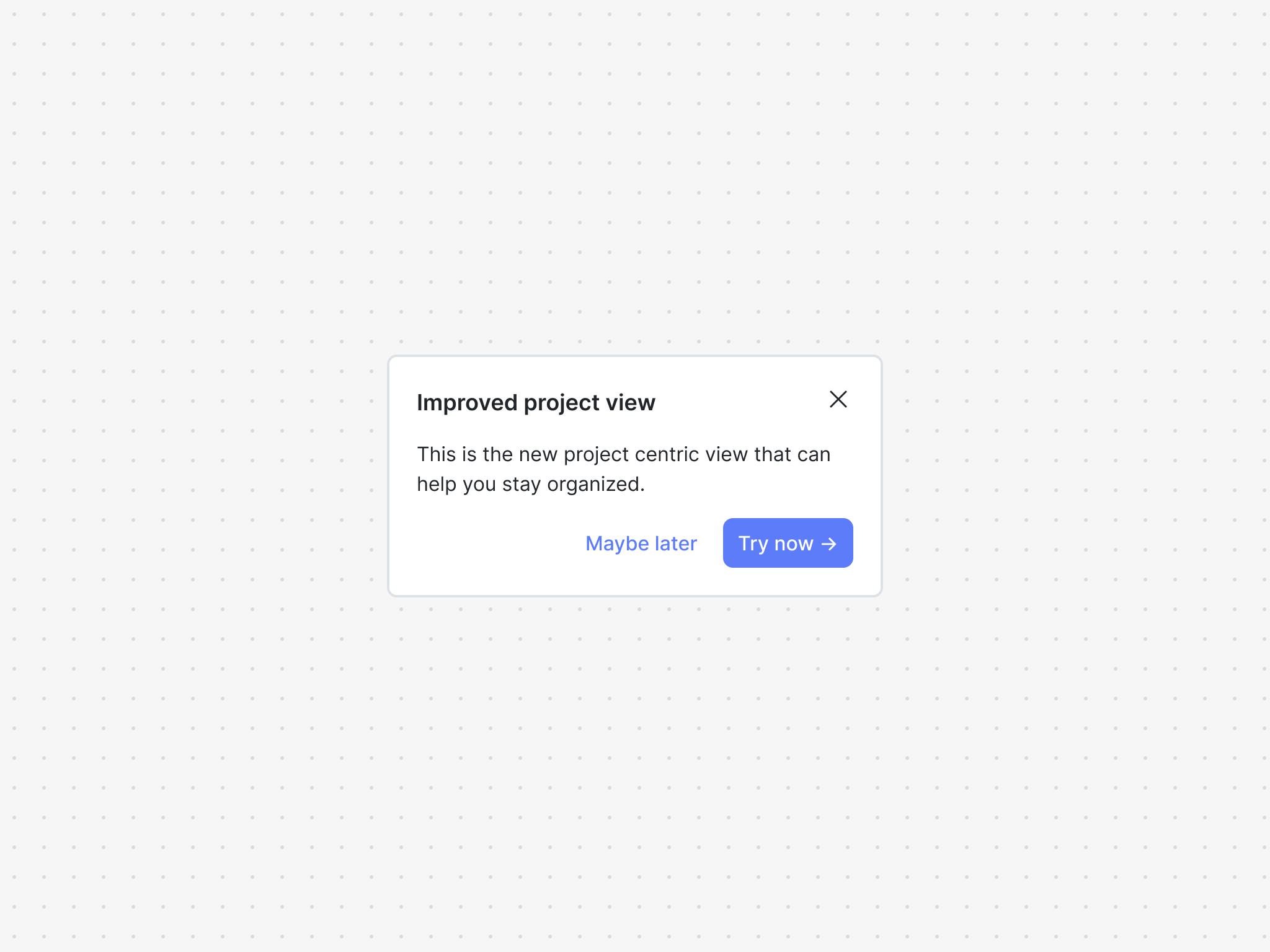
The card component is powered by a card block and is great for delivering announcements or giving users timely warnings and alerts. Cards are embedded, making them feel native to your app.
You can use the card component out of the box as a pre-built component or break out and use it headlessly with your own UI component.
Installation
If you are using a particular React framework like Next.js, please check out our framework specific docs.
- npm
- Yarn
- pnpm
npm install @dopt/react-card
yarn add @dopt/react-card
pnpm add @dopt/react-card
Usage
The default export from @dopt/react-card is a collection of components that you can use to structure and compose a card.
import Card, { useCard } from '@dopt/react-card';

function MyCard() {
  const card = useCard('my-flow.four-pandas-jam');

  return (
    <Card.Root active={card.active}>
      <Card.Content>
        <Card.Header>
          <Card.Title>{card.title}</Card.Title>
          <Card.DismissIcon onClick={card.dismiss} />
        </Card.Header>
        <Card.Body>{card.body}</Card.Body>
        <Card.Footer>
          <Card.DismissButton onClick={card.dismiss}>
            {card.dismissLabel}
          </Card.DismissButton>
          <Card.CompleteButton onClick={card.complete}>
            {card.completeLabel}
          </Card.CompleteButton>
        </Card.Footer>
      </Card.Content>
    </Card.Root>
  );
}
Check out our card example and our headless card example for more in-depth usage.
Props
Root
The root element of the card. Extends HTMLDivElement.
| Name | Type | Description |
|---|---|---|
| active? | boolean | Determines the visibility of the component (default: false) |
| children? | ReactNode | The contents of the component |
| theme? | Theme | A theme definition to attach to the component |
Content
The card content. Extends HTMLDivElement.
| Name | Type | Description |
|---|---|---|
| children? | ReactNode | The contents of the component |
| theme? | Theme | A theme definition to attach to the component |
Header
The header of the card. Extends HTMLElement.
| Name | Type | Description |
|---|---|---|
| children? | ReactNode | The contents of the component |
| theme? | Theme | A theme definition to attach to the component |
Title
The title of the card. Extends HTMLHeadingElement.
| Name | Type | Description |
|---|---|---|
| children? | ReactNode | The contents of the component |
| theme? | Theme | A theme definition to attach to the component |
DismissIcon
The dismiss icon of the card. Extends HTMLButtonElement.
| Name | Type | Description |
|---|---|---|
| theme? | Theme | A theme definition to attach to the component |
Body
The body of the card. Extends HTMLDivElement.
| Name | Type | Description |
|---|---|---|
| children? | RichText | The rich text contents of the component |
| theme? | Theme | A theme definition to attach to the component |
Footer
The footer of the card. Extends HTMLElement.
| Name | Type | Description |
|---|---|---|
| children? | ReactNode | The contents of the component |
| theme? | Theme | A theme definition to attach to the component |
DismissButton
The dismiss button of the card. Extends HTMLButtonElement.
| Name | Type | Description |
|---|---|---|
| children? | ReactNode | The contents of the component |
| theme? | Theme | A theme definition to attach to the component |
CompleteButton
The complete button of the card. Extends HTMLButtonElement.
| Name | Type | Description |
|---|---|---|
| children? | ReactNode | The contents of the component |
| theme? | Theme | A theme definition to attach to the component |
Styling API
Learn more about styling and theming →
| Name | Selector | Description |
|---|---|---|
| root | .dopt-card | Root element |
| content | .dopt-card__content | Content container |
| header | .dopt-card__header | Header containing title and dismiss icon |
| title | .dopt-card__title | Title heading |
| dismissIcon | .dopt-card__dismiss-icon | Dismiss icon button |
| body | .dopt-card__body | Body content |
| footer | .dopt-card__footer | Footer containing dismiss and complete buttons |
| dismissButton | .dopt-card__dismiss-button | Dismiss button |
| completeButton | .dopt-card__complete-button | Complete button |
Headless hooks
If you are planning to only use the card headlessly, you can import the hooks alone using @dopt/react-card/hooks.
useCard
- useCard(
id: string): Card
A React hook for accessing and updating a card's state and content.
import { useCard } from '@dopt/react-card';
import RichText from '@dopt/react-rich-text';

function MyCard() {
  const {
    id,
    title,
    body,
    completeLabel,
    dismissLabel,
    active,
    completed,
    dismissed,
    complete,
    dismiss,
  } = useCard('my-flow.four-pandas-jam');

  return (
    <div>
      <div id="states">
        <div>card.active: {active}</div>
        <div>card.completed: {completed}</div>
        <div>card.dismissed: {dismissed}</div>
      </div>
      <div id="actions">
        <button onClick={complete}>{completeLabel}</button>
        <button onClick={dismiss}>{dismissLabel}</button>
      </div>
      <div id="content">
        <div>card.title: {title}</div>
        <div>
          card.body: <RichText>{body}</RichText>
        </div>
        <div>card.completeLabel: {completeLabel}</div>
        <div>card.dismissLabel: {dismissLabel}</div>
      </div>
    </div>
  );
}
Types
Card
Card state accessors and methods for updating state along with content configured in Dopt.
interface Card {
  id: string;

  title: string | null | undefined;
  body: RichText | null | undefined;

  completeLabel: string | null | undefined;
  dismissLabel: string | null | undefined;

  active: boolean;

  completed: boolean;
  dismissed: boolean;

  field: <V>(name: string) => undefined | null | V;

  complete: () => void;
  dismiss: () => void;
}