React components
Modal
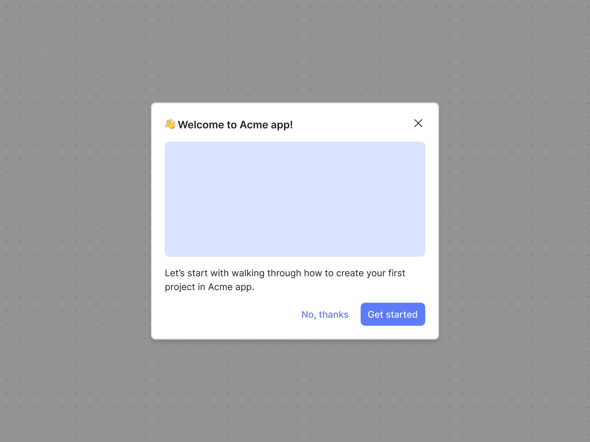
The modal component is great for focusing a user’s attention on important information in a dialog interface separate from the rest of the content on the page.
Tour
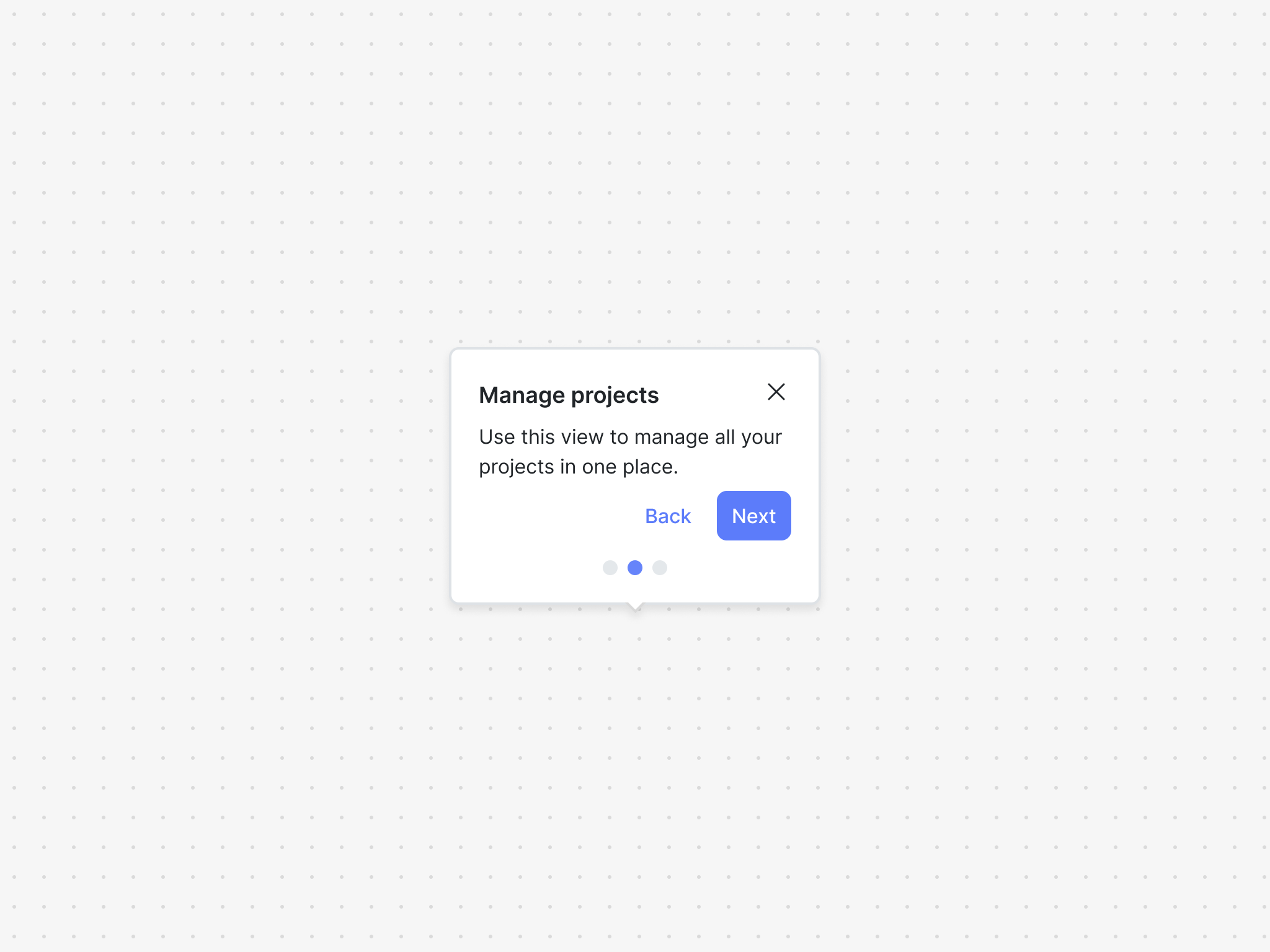
The tour component is a great way to guide your user through new, undiscovered, or updated product features.
Checklist
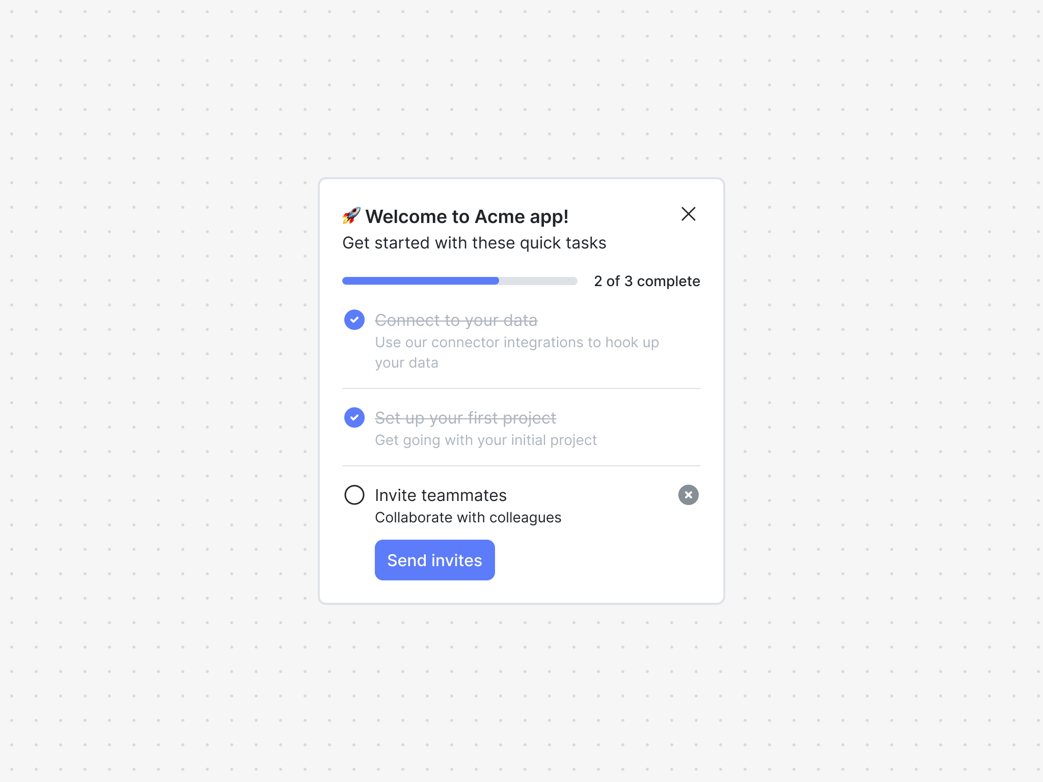
The checklist component is a great way to get your users up and running in your product.
Hints
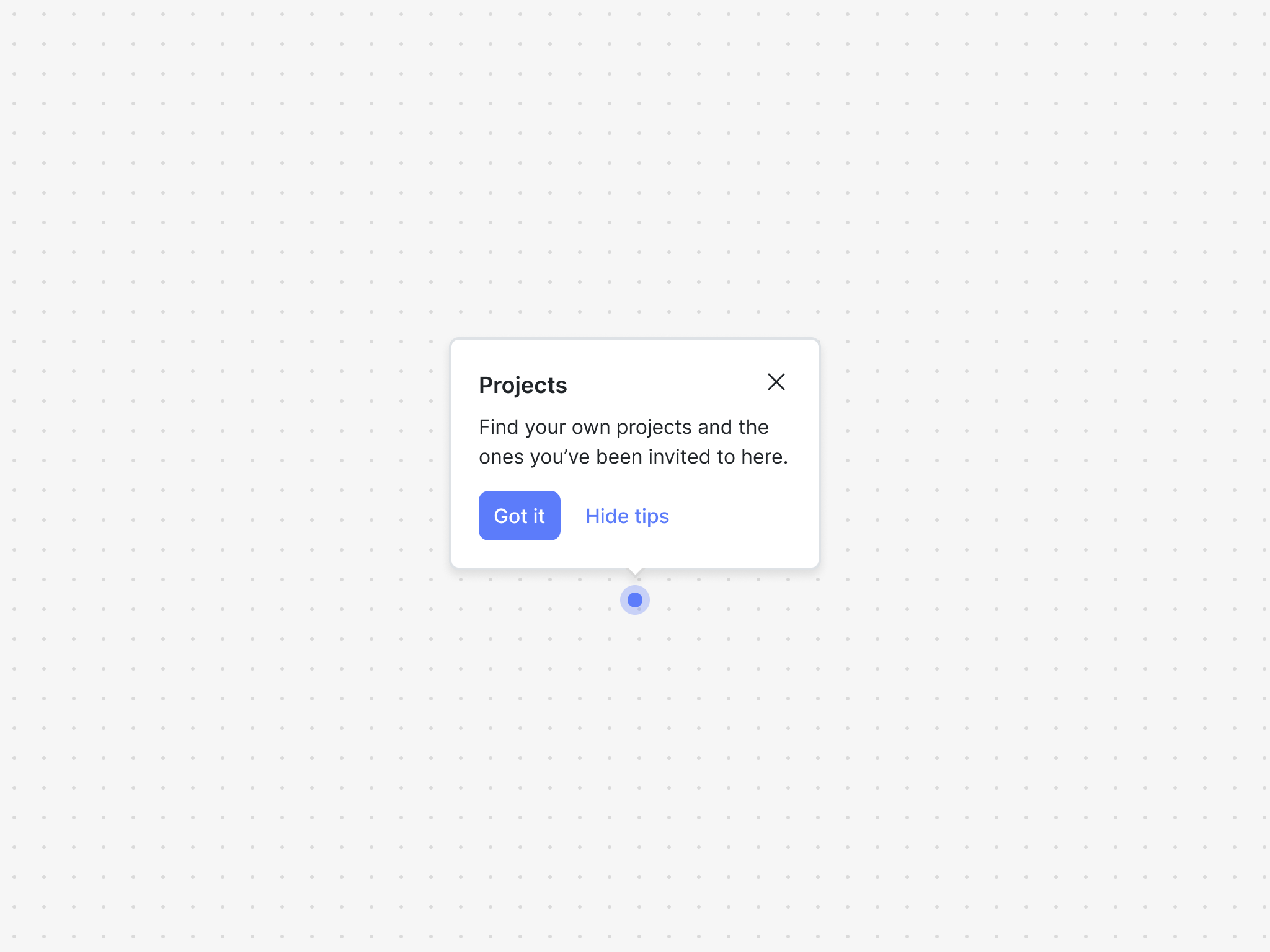
The hints component is a great way to call attention to UI elements to help users discover new features, provide contextual help, or nudge them towards a good next step.
Card
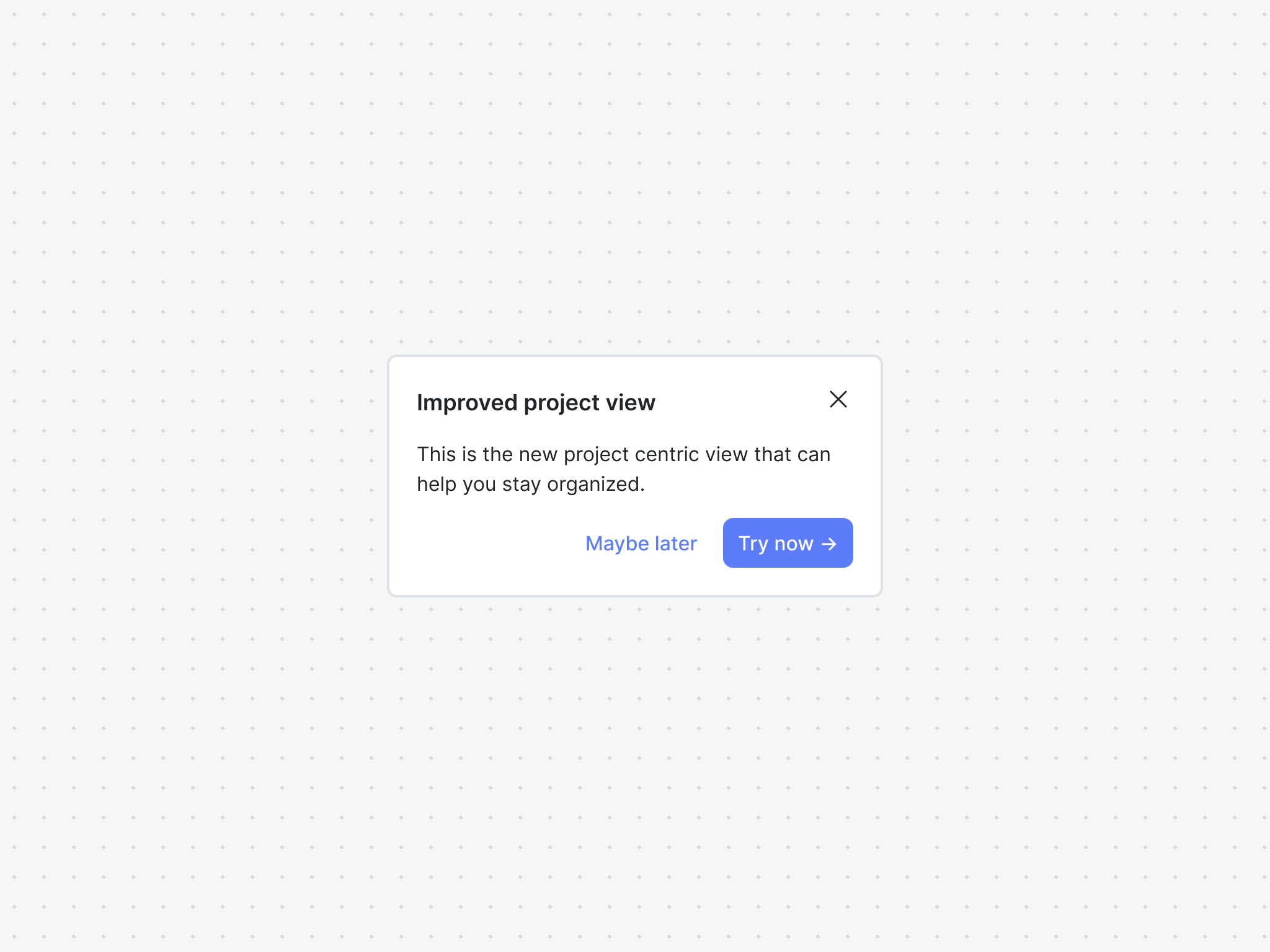
The card component is an embedded UI element that is great for announcing updates or give users timely warnings and alerts.
Contextual assistant
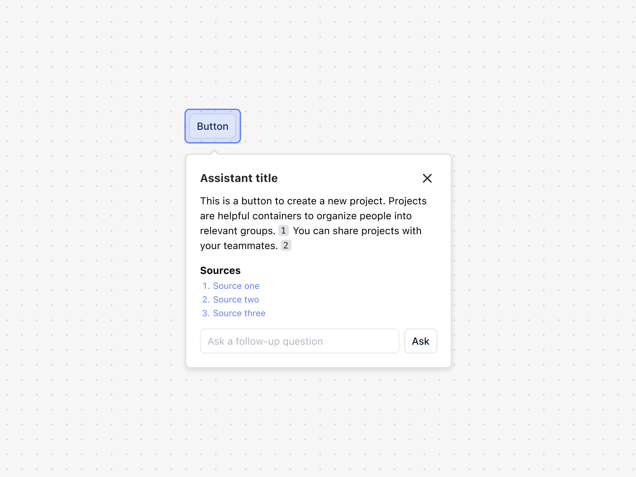
The contextual assistant is a component that allows the user to point and select elements on the page and get rich AI-powered information about the selection.
Help hub
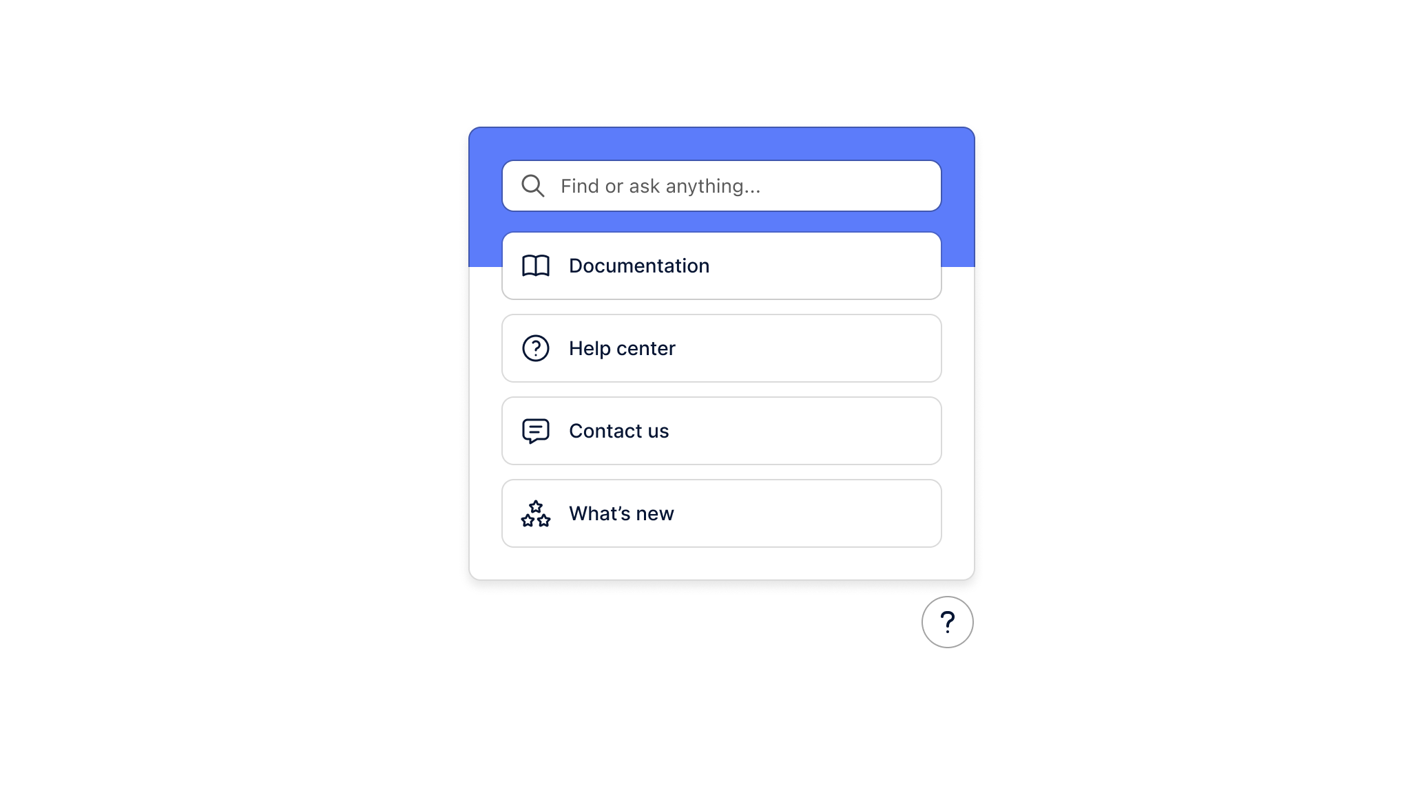
The help hub is a component that allows the user to search and ask questions about your product and get rich AI-powered search results and answers.
Rich text
Use our rich text components to render rich text content within your product.
Frameworks
Framework-specific guides on how to use Dopt's React components in Next.js, Remix, webpack, and more.
Styling & theming
Styling and theme Dopt React components so they look and feel like they're part of your product.
Tokens
Use our flexible theme tokens to easily style components.