Tour
Overview
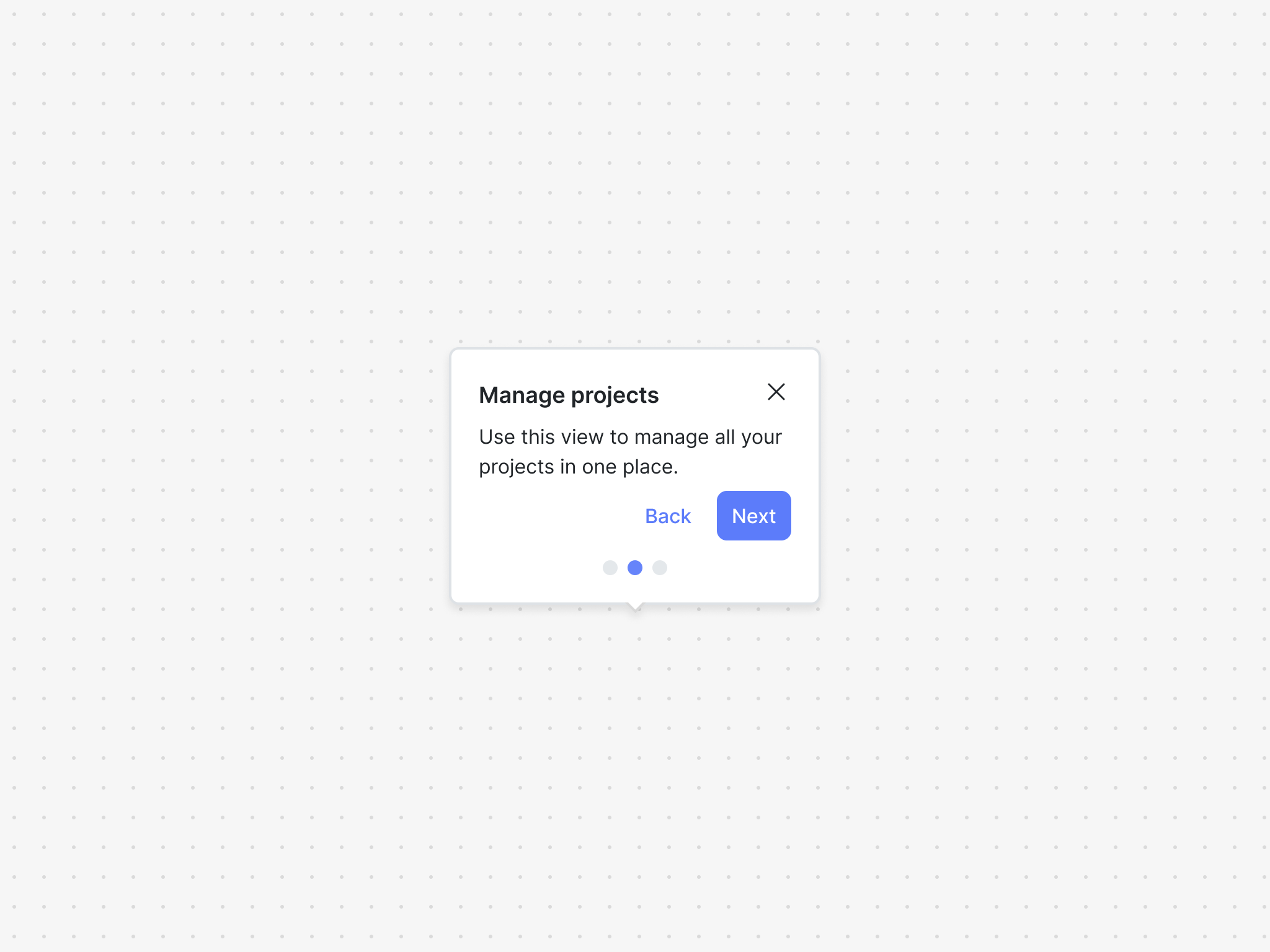
The tour component is powered by a tour block and is great way to guide your user through new, undiscovered, or updated product features.
A tour block is comprised of items, which are the ordered set of steps in the tour.
The tour component exposes two hooks and a family of UI components to easily built product tours.
Installation
If you are using a particular React framework like Next.js, please check out our framework specific docs.
- npm
- Yarn
- pnpm
npm install @dopt/react-tour
yarn add @dopt/react-tour
pnpm add @dopt/react-tour
Usage
The default export from @dopt/react-tour is a collection of components that you can use to structure and compose a tour item.
import TourItem, { useTourItem } from '@dopt/react-tour';

function MyTourStep({ children }) {
  const tourItem = useTourItem('tour.shaggy-horses-sniff');

  if (!tourItem) {
    return children;
  }

  return (
    <TourItem.Root active={tourItem.active}>
      <TourItem.Anchor>{children}</TourItem.Anchor>
      <TourItem.Popover>
        <TourItem.Content>
          <TourItem.Header>
            <TourItem.Title>{tourItem.title}</TourItem.Title>
            <TourItem.DismissIcon onClick={tourItem.tour?.dismiss} />
          </TourItem.Header>
          <TourItem.Body>{tourItem.body}</TourItem.Body>
          <TourItem.Footer>
            <TourItem.BackButton>{tourItem.backLabel}</TourItem.BackButton>
            <TourItem.NextButton onClick={tourItem.next}>
              {tourItem.nextLabel}
            </TourItem.NextButton>
          </TourItem.Footer>
          <TourItem.Progress
            count={tourItem.tour?.size || 1}
            index={tourItem.index}
          />
        </TourItem.Content>
      </TourItem.Popover>
    </TourItem.Root>
  );
}
Check out our tour example and our headless tour example for more in-depth usage.
Props
Root
The root element of the tour item.
| Name | Type | Description |
|---|---|---|
| active? | boolean | Determines the visibility of the component (default: false) |
| children? | ReactNode | The contents of the component |
| theme? | Theme | A theme definition to attach to the component |
Anchor
The element to anchor the tour item to.
| Name | Type | Description |
|---|---|---|
| children | ReactElement | A React element to anchor to |
Popover
The tour item popover. Extends HTMLDivElement.
| Name | Type | Description |
|---|---|---|
| alignment? | Alignment | Determines how the component should align relative to the anchor element (default: center) |
| children? | ReactNode | The contents of the component |
| offset? | number | The distance in px to position the component relative to the anchor element (default: 10) |
| position? | Side | The side that the component should position relative to the anchor element (default: top) |
| theme? | Theme | A theme definition to attach to the component |
Content
The content of the tour item popover. Extends HTMLDivElement.
| Name | Type | Description |
|---|---|---|
| children? | ReactNode | The contents of the component |
| theme? | Theme | A theme definition to attach to the component |
Header
The header of the tour item popover. Extends HTMLElement.
| Name | Type | Description |
|---|---|---|
| children? | ReactNode | The contents of the component |
| theme? | Theme | A theme definition to attach to the component |
Title
The title of the tour item popover. Extends HTMLHeadingElement.
| Name | Type | Description |
|---|---|---|
| children? | ReactNode | The contents of the component |
| theme? | Theme | A theme definition to attach to the component |
Content
The content of the tour item popover. Extends HTMLDivElement.
| Name | Type | Description |
|---|---|---|
| children? | ReactNode | The contents of the component |
| theme? | Theme | A theme definition to attach to the component |
DismissIcon
The dismiss icon of the tour item popover. Extends HTMLButtonElement.
| Name | Type | Description |
|---|---|---|
| theme? | Theme | A theme definition to attach to the component |
Body
The body of the tour item popover. Extends HTMLDivElement.
| Name | Type | Description |
|---|---|---|
| children? | RichText | The rich text contents of the component |
| theme? | Theme | A theme definition to attach to the component |
Footer
The footer of the tour item popover. Extends HTMLElement.
| Name | Type | Description |
|---|---|---|
| children? | ReactNode | The contents of the component |
| theme? | Theme | A theme definition to attach to the component |
NextButton
The next button of the tour item popover. Extends HTMLButtonElement.
| Name | Type | Description |
|---|---|---|
| children? | ReactNode | The contents of the component |
| theme? | Theme | A theme definition to attach to the component |
BackButton
The back button of the tour item popover. Extends HTMLButtonElement.
| Name | Type | Description |
|---|---|---|
| children? | ReactNode | The contents of the component |
| theme? | Theme | A theme definition to attach to the component |
Progress
The progress indicators of the tour item popover. Extends HTMLOListElement.
| Name | Type | Description |
|---|---|---|
| count | number | The total count of items |
| index | number | The current item index |
| theme? | Theme | A theme definition to attach to the component |
Styling API
Learn more about styling and theming →
| Name | Selector | Description |
|---|---|---|
| popover | .dopt-tour-item | Popover element |
| content | .dopt-tour-item__content | Content container |
| header | .dopt-tour-item__header | Header containing title and dismiss icon |
| title | .dopt-tour-item__title | Title heading |
| dismissIcon | .dopt-tour-item__dismiss-icon | Disiss icon button |
| body | .dopt-tour-item__body | Body content |
| footer | .dopt-tour-item__footer | Footer containing back and next buttons |
| backButton | .dopt-tour-item__back-button | Back button |
| nextButton | .dopt-tour-item__next-button | Next button |
| progress | .dopt-tour-item__progress | Progress indicators |
| progressItem | .dopt-tour-item-progress__item | Progress indicator item |
Popover position
| Name | Selector | Description |
|---|---|---|
| top | .dopt-tour-item--top | Positioned top |
| top | [data-position="top"] | Positioned top |
| right | .dopt-tour-item--right | Positioned right |
| right | [data-position="right"] | Positioned right |
| bottom | .dopt-tour-item--bottom | Positioned bottom |
| bottom | [data-position="bottom"] | Positioned bottom |
| left | .dopt-tour-item--left | Positioned left |
| left | [data-position="left"] | Positioned left |
Popover alignment
| Name | Selector | Description |
|---|---|---|
| start | .dopt-tour-item--start | Aligned start |
| start | [data-alignment="start"] | Aligned start |
| center | .dopt-tour-item--center | Aligned center |
| center | [data-alignment="center"] | Aligned center |
| end | .dopt-tour-item--end | Aligned end |
| end | [data-alignment="end"] | Aligned end |
Progress item state
| Name | Selector | Description |
|---|---|---|
| active | .dopt-tour-item-progress__item--active | Active progress item |
Headless hooks
If you are planning to only use the tour headlessly, you can import the hooks alone using @dopt/react-tour/hooks.
useTour
- useTour(
id: string): Tour
A React hook for accessing and updating a tour's state.
import { useTour } from '@dopt/react-tour';

export function MyTourStep() {
  const {
    id,
    items,
    active,
    completed,
    dismissed,
    complete,
    dismiss,
    filter,
    count,
    size,
  } = useTour('onboarding-tour.tour-component');

  return (
    <div>
      <div id="states">
        <div>tour.active: {active}</div>
        <div>tour.completed: {completed}</div>
        <div>tour.dismissed: {dismissed}</div>
      </div>
      <div id="actions">
        <button onClick={complete}>Complete</button>
        <button onClick={dismiss}>Dismiss</button>
      </div>
      <div id="children">
        tour.items: {items.map((item) => item.id).join(' ')}
      </div>
      <div id="filtering">
        <div id="active-items">
          {filter('active')
            .map((item) => item.id)
            .join(' ')}
        </div>
        <div id="not-active-items">
          {filter('not-active')
            .map((item) => item.id)
            .join(' ')}
        </div>
        <div id="completed-items">
          {filter('completed')
            .map((item) => item.id)
            .join(' ')}
        </div>
        <div id="not-completed-items">
          {filter('not-completed')
            .map((item) => item.id)
            .join(' ')}
        </div>
      </div>
      <div id="metadata">
        <div>tour.size: {size}</div>
      </div>
    </div>
  );
}
useTourItem
- useTourItem(
id): TourItem
A React hook for accessing and updating a tour item's state and content.
import { useTourItem } from '@dopt/react-tour';
import RichText from '@dopt/react-rich-text';

export function Application() {
  const {
    id,
    tour,
    index,
    title,
    body,
    nextLabel,
    backLabel,
    active,
    completed,
    next,
    back,
  } = useTourItem('onboarding-tour.step-1');

  return (
    <div>
      <div id="states">
        <div>tourItem.active: {active}</div>
        <div>tourItem.completed: {completed}</div>
      </div>
      <div id="actions">
        <button onClick={next}>{nextLabel}</button>
        <button onClick={back}>{backLabel}</button>
      </div>
      <div id="content">
        <div>tourItem.title: {title}</div>
        <div>
          tourItem.body: <RichText>{body}</RichText>
        </div>
        <div>tourItem.nextLabel: {nextLabel}</div>
        <div>tourItem.backLabel: {backLabel}</div>
      </div>
      <div id="parent">
        <div>tourItem.tour: {tour?.id}</div>
      </div>
      <div id="metadata">
        <div>tourItem.index: {tourItem.index}</div>
      </div>
    </div>
  );
}
Types
Tour
A stateful container for tour items.
interface Tour {
  id: string;

  items: TourItem[];

  active: boolean;

  completed: boolean;
  dismissed: boolean;

  field: <V>(name: string) => undefined | null | V;

  complete: () => void;
  dismiss: () => void;

  size: number;

  filter(on: FilterableField): TourItem[];
  count(where: CountableField): number;
}
TourItem
A child of the tour. Includes state accessors and methods for updating state along with content configured in Dopt.
interface TourItem {
  id: string;

  tour: Tour | undefined;

  index: number | null | undefined;

  title: string | null | undefined;
  body: RichText | null | undefined;

  nextLabel: string | null | undefined;
  backLabel: string | null | undefined;

  active: boolean;

  completed: boolean;

  field: <V>(name: string) => undefined | null | V;

  next: () => void;
  back: () => void;
}
FilterableField
type FilterableField = 'completed' | 'not-completed' | 'active' | 'not-active';
CountableField
type CountableField = FilterableField;
Alignment
type Alignment = 'start' | 'center' | 'end';
Position
type Side = 'top' | 'right' | 'bottom' | 'left';