Help hub
Overview
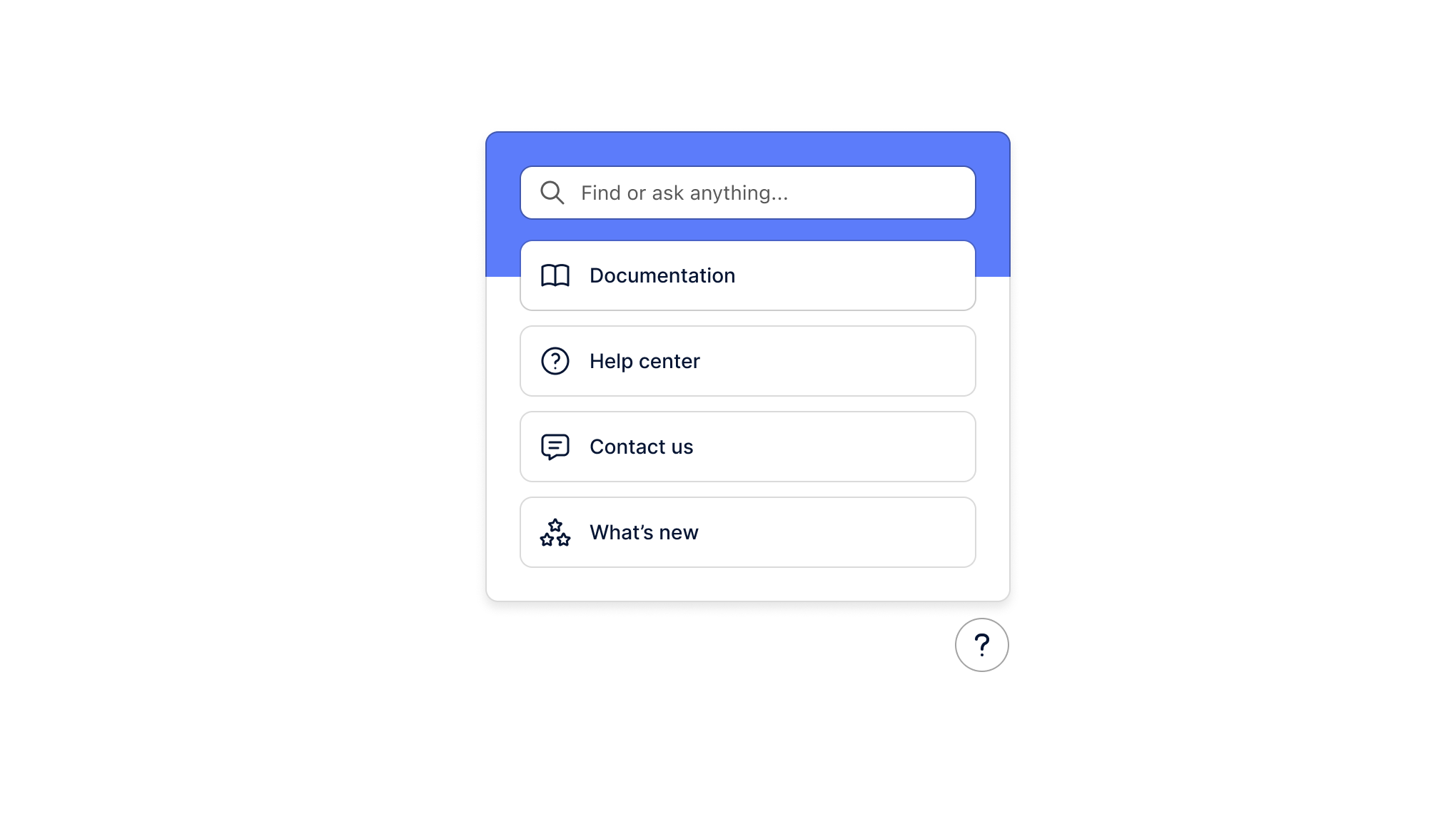
The help hub component is powered by an Assistant and is a great way for your users to learn more about your product by directly searching through crawled documentation and asking questions to the assistant.
You can use the help hub component as a pre-built component or break out and use it headlessly with your own UI component.
Installation
If you are using a particular React framework like Next.js, please check out our framework specific docs.
- npm
- Yarn
- pnpm
npm install @dopt/react-help-hub
yarn add @dopt/react-help-hub
pnpm add @dopt/react-help-hub
Usage
The default export from @dopt/react-help-hub is a collection of components that you can use to structure and compose the help hub.
We provide a state, data, and business logic management hook with useHelpHub which controls search and assistant query state and returns results.
You can use our pre-provided components which map neatly with useHelpHub as shown below. You can also work with useHelpHub headlessly and use your own components.
import HelpHub, { useHelpHub } from '@dopt/react-help-hub';

function MyHelpHub({ children }) {
  const helpHub = useHelpHub('assistant-sid');

  return (
    <HelpHub.Root>
      <HelpHub.Activator>
        <HelpHub.Launcher
          isOpen={helpHub.isOpen}
          onClick={() => (helpHub.isOpen ? helpHub.close() : helpHub.open())}
          style={{
            position: 'absolute',
            bottom: 0,
            right: 0,
            zIndex: 10000,
          }}
        />
      </HelpHub.Activator>
      <HelpHub.Popover position="top" alignment="end" isOpen={helpHub.isOpen}>
        <HelpHub.Content>
          <HelpHub.Header>
            {helpHub.askQuery ? (
              <HelpHub.BackIcon onClick={() => helpHub.backToSearch()} />
            ) : (
              <HelpHub.Title>Learn more</HelpHub.Title>
            )}
            <HelpHub.CloseIcon onClick={() => helpHub.close()} />
          </HelpHub.Header>
          {!helpHub.askQuery && (
            <HelpHub.SearchInput onEnteredSearch={helpHub.search}>
              {helpHub.searchQuery}
            </HelpHub.SearchInput>
          )}
          <HelpHub.Body>
            {helpHub.askQuery ? (
              <>
                <HelpHub.BodyHeading>{helpHub.askQuery}</HelpHub.BodyHeading>
                {helpHub.askAnswer ? (
                  <HelpHub.Answer>{helpHub.askAnswer}</HelpHub.Answer>
                ) : (
                  <HelpHub.Loader />
                )}
                {helpHub.askSources && helpHub.askSources.length > 0 && (
                  <>
                    <HelpHub.BodyHeading>Sources</HelpHub.BodyHeading>
                    <HelpHub.SourceList>
                      {helpHub.askSources.map((document) => {
                        return (
                          <HelpHub.Source
                            key={document.id}
                            index={document.id}
                            url={document.url}
                            title={document.title}
                          />
                        );
                      })}
                    </HelpHub.SourceList>
                  </>
                )}
              </>
            ) : (
              <HelpHub.SourceList>
                {helpHub.searchQuery ? (
                  <>
                    <HelpHub.AskItem
                      query={helpHub.searchQuery}
                      onClick={() => helpHub.ask()}
                    />
                    {!helpHub.searchResults ? (
                      <HelpHub.Loader />
                    ) : (
                      helpHub.searchResults.map((document) => {
                        return (
                          <HelpHub.Source
                            key={document.id}
                            url={document.url}
                            title={document.title}
                            content={document.chunks[0]?.text}
                          />
                        );
                      })
                    )}
                  </>
                ) : (
                  <>
                    <HelpHub.Source
                      url="docs.url"
                      title="Visit our docs"
                      hideUrl
                    />
                    <HelpHub.Source url="help.url" title="Get Help!" hideUrl />
                    <HelpHub.Source
                      url="community.url"
                      title="Join our community"
                      hideUrl
                    />
                  </>
                )}
              </HelpHub.SourceList>
            )}
          </HelpHub.Body>
          {helpHub.askQuery && (
            <HelpHub.Question canAsk={helpHub.canAsk} ask={helpHub.ask} />
          )}
        </HelpHub.Content>
      </HelpHub.Popover>
    </HelpHub.Root>
  );
}
Props
useHelpHub
A data fetching, business logic, and state management hook for interacting with search and assistant querying for a help hub.
| Name | Type | Description |
|---|---|---|
| sid | string | The Assistant in Dopt that this help hub is associated with. |
| options? | An object with one key, errorMessage | If options.errorMessage is provided, the error message to show when results are not returned correctly |
Root
The help hub root component. Extends HTMLDivElement.
| Name | Type | Description |
|---|---|---|
| children? | ReactNode | The activator and popover within the help hub |
Activator
The help hub activator. This component is necessary so that the popover knows which element to position against.
| Name | Type | Description |
|---|---|---|
| children? | ReactNode | The launcher to popover the position against |
Launcher
The help hub launcher button containing a ? icon. Extends HTMLDivElement.
| Name | Type | Description |
|---|---|---|
| isOpen | boolean | Whether the popover is open or closed |
| theme? | Theme | A theme definition to attach to the component |
Popover
The help hub popover. Extends HTMLDivElement.
| Name | Type | Description |
|---|---|---|
| isOpen | boolean | Whether the popover is open or closed |
| alignment? | Alignment | Determines how the component should align relative to the anchor element (default: center) |
| children? | ReactNode | The contents of the component |
| offset? | number | The distance in px to position the component relative to the anchor element (default: 10) |
| position? | Side | The side that the component should position relative to the anchor element (default: top) |
| theme? | Theme | A theme definition to attach to the component |
Content
The help hub popover's content. Extends HTMLDivElement.
| Name | Type | Description |
|---|---|---|
| children? | ReactNode | The contents of the component |
| theme? | Theme | A theme definition to attach to the component |
Header
The header of The help hub popover. Extends HTMLElement.
| Name | Type | Description |
|---|---|---|
| children? | ReactNode | The contents of the component |
| theme? | Theme | A theme definition to attach to the component |
Title
The title of the help hub popover. Extends HTMLHeadingElement.
| Name | Type | Description |
|---|---|---|
| children? | ReactNode | The contents of the component |
| theme? | Theme | A theme definition to attach to the component |
CloseIcon
The dismiss icon of the help hub popover. Extends HTMLButtonElement.
| Name | Type | Description |
|---|---|---|
| theme? | Theme | A theme definition to attach to the component |
BackIcon
The back icon of the help hub popover. Extends HTMLButtonElement.
| Name | Type | Description |
|---|---|---|
| theme? | Theme | A theme definition to attach to the component |
Body
The body of the help hub popover. Extends HTMLDivElement.
| Name | Type | Description |
|---|---|---|
| children? | ReactNode | The contents of the component |
| theme? | Theme | A theme definition to attach to the component |
BodyHeading
The body heading of the help hub popover. Extends HTMLDivElement.
| Name | Type | Description |
|---|---|---|
| children? | ReactNode | The contents of the component |
| theme? | Theme | A theme definition to attach to the component |
Loader
The loading component of the help hub popover. Extends HTMLDivElement.
| Name | Type | Description |
|---|---|---|
| theme? | Theme | A theme definition to attach to the component |
Answer
The answer for the assistant's query in the help hub popover. Extends HTMLDivElement.
| Name | Type | Description |
|---|---|---|
| children? | string \| null | The markdown contents of the component |
| theme? | Theme | A theme definition to attach to the component |
SourceList
A list of documents in the help hub popover. Extends HTMLDivElement.
| Name | Type | Description |
|---|---|---|
| children? | ReactNode | The contents of the component |
| theme? | Theme | A theme definition to attach to the component |
AskItem
An item within a source list which directly asks a question to the assistant. Extends HTMLDivElement.
| Name | Type | Description |
|---|---|---|
| query | string | The query to be asked to the assistant |
| theme? | Theme | A theme definition to attach to the component |
Source
A document, either from search results or as a source to the assistant's answer, in the help hub popover. Extends HTMLDivElement.
| Name | Type | Description |
|---|---|---|
| url? | string | The source url this element links to |
| index? | number | A key given this is an element in a rendered collection |
| title? | string | The title of the source |
| content? | string | The content of the source |
| hideUrl? | boolean | Whether the url should be displayed |
| theme? | Theme | A theme definition to attach to the component |
SearchInput
The input where users can search for relevant documents. Extends HTMLDivElement.
| Name | Type | Description |
|---|---|---|
| children? | string \| null | The current typed search |
| placeholder? | string | A placeholder to show if no search is entered |
| search | (query: string) => void | A function which is called when the input value changes |
| theme? | Theme | A theme definition to attach to the component |
Question
The input where users can ask the assistant questions. Extends HTMLDivElement.
If users should not have the ability to ask questions, this component can simply not be used.
| Name | Type | Description |
|---|---|---|
| placeholder? | string | A placeholder to show if no question is entered |
| canAsk | boolean | A boolean which controls if users can send their question |
| ask | (query: string) => void | A function which is called when users submit their question |
| theme? | Theme | A theme definition to attach to the component |
Styling API
Learn more about styling and theming →
| Name | Selector | Description |
|---|---|---|
| launcher | .dopt-help-hub__launcher | Launcher element |
| popover | .dopt-help-hub__popover | Popover element |
| content | .dopt-help-hub__content | Content container |
| header | .dopt-help-hub__header | Header containing title and dismiss icon |
| title | .dopt-help-hub__title | Title heading |
| closeIcon | .dopt-help-hub__close-icon | Close icon button |
| backIcon | .dopt-help-hub__back-icon | Back icon button |
| body | .dopt-help-hub__body | Body content |
| bodyHeading | .dopt-help-hub__body-heading | Body heading |
| loader | .dopt-help-hub__loader | Loading state |
| answer | .dopt-help-hub__answer | Text answer from AI API |
| sources | .dopt-help-hub__sources | Collection of sources matching query |
| source | .dopt-help-hub__source | Individual source matching query |
| source | .dopt-help-hub__source-link-index | Index of source matching query |
| source | .dopt-help-hub__source-link-metadata-title | Title of source matching query |
| source | .dopt-help-hub__source-link-metadata-url | URL of source matching query |
| source | .dopt-help-hub__source-link-metadata-content | Content of source matching query |
| askItem | .dopt-help-hub__ask-item | Item which links to assistant |
| search input | .dopt-help-hub__search-input | Search input |
| question | .dopt-help-hub__question | Follow-up question element |
| question input | .dopt-help-hub__question-input | Follow-up question input |
| question button | .dopt-help-hub__question-button | Follow-up question button |