Checklist
Source@dopt/react-checklistFigma
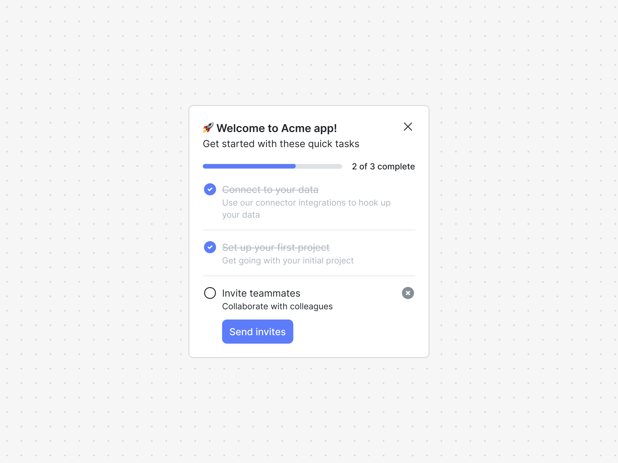
Overview
The checklist component is powered by a checklist block and is great way to get your users up and running in your product.
A checklist block is comprised of items, which are the set of steps in the checklist.
The checklist component exposes two hooks and a family of UI components to easily build checklists.
Installation
If you are using a particular React framework like Next.js, please check out our framework specific docs.
- npm
- Yarn
- pnpm
npm install @dopt/react-checklist
yarn add @dopt/react-checklist
pnpm add @dopt/react-checklist
Usage
The default export from @dopt/react-checklist is a collection of components that you can use to structure and compose a checklist.
import Checklist, { useChecklist } from '@dopt/react-checklist';

function MyChecklist() {
  const checklist = useChecklist('checklist.pink-crews-clap');

  return (
    <Checklist.Root>
      <Checklist.Header>
        <Checklist.Title>{checklist.title}</Checklist.Title>
        <Checklist.DismissIcon onClick={checklist.dismiss} />
      </Checklist.Header>
      <Checklist.Body>{checklist.body}</Checklist.Body>
      <Checklist.Progress
        value={checklist.count('done')}
        max={checklist.size}
      />
      <Checklist.Items>
        {checklist.items.map((item, i) => (
          <Checklist.Item key={i}>
            <Checklist.ItemIcon>
              {item.completed ? (
                <Checklist.IconCompleted />
              ) : item.skipped ? (
                <Checklist.IconSkipped />
              ) : (
                <Checklist.IconActive />
              )}
            </Checklist.ItemIcon>
            <Checklist.ItemContent>
              <Checklist.ItemTitle disabled={item.done}>
                {item.title}
              </Checklist.ItemTitle>

              <Checklist.ItemBody disabled={item.done}>
                {item.body}
              </Checklist.ItemBody>

              {!item.done && (
                <Checklist.ItemCompleteButton onClick={item.complete}>
                  {item.completeLabel}
                </Checklist.ItemCompleteButton>
              )}
            </Checklist.ItemContent>
            {!item.done && <Checklist.ItemSkipIcon onClick={item.skip} />}
          </Checklist.Item>
        ))}
      </Checklist.Items>
    </Checklist.Root>
  );
}
Check out our checklist example and our headless checklist example for more in-depth usage.
Props
Root
The root element of the checklist. Extends HTMLElement.
| Name | Type | Description |
|---|---|---|
| children? | ReactNode | The contents of the component |
| theme? | Theme | A theme definition to attach to the component |
Header
The header of the checklist. Extends HTMLElement.
| Name | Type | Description |
|---|---|---|
| children? | ReactNode | The contents of the component |
| theme? | Theme | A theme definition to attach to the component |
Title
The title of the checklist. Extends HTMLHeadingElement.
| Name | Type | Description |
|---|---|---|
| children? | ReactNode | The contents of the component |
| theme? | Theme | A theme definition to attach to the component |
DismissIcon
The dismiss icon of the checklist. Extends HTMLButtonElement.
| Name | Type | Description |
|---|---|---|
| theme? | Theme | A theme definition to attach to the component |
Body
The body of the checklist. Extends HTMLDivElement.
| Name | Type | Description |
|---|---|---|
| children? | RichText | The rich text contents of the component |
| theme? | Theme | A theme definition to attach to the component |
Progress
The progress meter of the checklist. Extends HTMLDivElement.
| Name | Type | Description |
|---|---|---|
| max | number | The maximum number of items that can be progressed |
| theme? | Theme | A theme definition to attach to the component |
| value | number | The current number of items progressed |
Items
The items of the checklist. Extends HTMLUListElement.
| Name | Type | Description |
|---|---|---|
| children? | ReactNode | The contents of the component |
| theme? | Theme | A theme definition to attach to the component |
Item
A checklist item. Extends HTMLLIElement.
| Name | Type | Description |
|---|---|---|
| children? | ReactNode | The contents of the component |
| index? | number | The index of the item |
| theme? | Theme | A theme definition to attach to the component |
ItemIcon
The icon of a checklist item. Extends HTMLDivElement.
| Name | Type | Description |
|---|---|---|
| children? | ReactNode | The contents of the component |
| theme? | Theme | A theme definition to attach to the component |
IconActive
The active icon. Extends SVGSVGElement.
IconCompleted
The completed icon. Extends SVGSVGElement.
IconSkipped
The skipped icon. Extends SVGSVGElement.
ItemContent
The content of a checklist item. Extends HTMLDivElement.
| Name | Type | Description |
|---|---|---|
| children? | ReactNode | The contents of the component |
| theme? | Theme | A theme definition to attach to the component |
ItemTitle
The title of a checklist item. Extends HTMLDivElement.
| Name | Type | Description |
|---|---|---|
| children? | ReactNode | The contents of the component |
| theme? | Theme | A theme definition to attach to the component |
ItemBody
The body of a checklist item. Extends HTMLDivElement.
| Name | Type | Description |
|---|---|---|
| children? | RichText | The rich text contents of the component |
| theme? | Theme | A theme definition to attach to the component |
| disabled? | boolean | Determines if the body is show as disabled (default: false) |
CompleteButton
The complete button of a checklist item. Extends HTMLButtonElement.
| Name | Type | Description |
|---|---|---|
| children? | ReactNode | The contents of the component |
| theme? | Theme | A theme definition to attach to the component |
SkipIcon
The skip icon of a checklist item. Extends HTMLButtonElement.
| Name | Type | Description |
|---|---|---|
| theme? | Theme | A theme definition to attach to the component |
Styling API
| Name | Selector | Description |
|---|---|---|
| root | .dopt-checklist | Root element |
| header | .dopt-checklist__header | Header containing title, body, and dismiss icon |
| title | .dopt-checklist__title | Title heading |
| body | .dopt-checklist__body | Body content |
| dismissIcon | .dopt-checklist__dismiss-icon | Dismiss icon button |
| progress | .dopt-checklist__progress | Progress container |
| progressMeter | .dopt-checklist__progress-meter | Progress meter |
| progressMeterBar | .dopt-checklist__progress-meter-bar | Progress meter bar |
| progressContent | .dopt-checklist__progress-content | Progress content |
| items | .dopt-checklist__items | Items container |
Item
| Name | Selector | Description |
|---|---|---|
| item | .dopt-checklist__item | Item containing icon, content, and skip icon |
| item | .dopt-checklist__item--$index | Item by index (starting at 1) |
| itemIcon | .dopt-checklist__item-icon | State icon |
| itemContent | .dopt-checklist__item-content | Content containing title, body, and complete button |
| itemTitle | .dopt-checklist__item-title | Title heading |
| itemBody | .dopt-checklist__item-body | Body content |
| itemCompleteButton | .dopt-checklist__item-complete-button | Complete button |
| itemSkipIcon | .dopt-checklist__item-skip-icon | Skip icon button |
Icon
| Name | Selector | Description |
|---|---|---|
| icon | .dopt-checklist__icon | Icon element |
| active | .dopt-checklist__icon-active | Active icon |
| completed | .dopt-checklist__icon-completed | Completed icon |
| skipped | .dopt-checklist__icon-skipped | Skipped icon |
Headless hooks
If you are planning to only use the checklist headlessly, you can import the hooks alone using @dopt/react-checklist/hooks.
useChecklist
- useChecklist(
id: string): Checklist
A React hook for managing a checklist's state and content.
import { useChecklist } from '@dopt/react-checklist';
import RichText from '@dopt/react-rich-text';

export function MyChecklist() {
  const {
    id,
    title,
    body,
    items,
    active,
    completed,
    dismissed,
    complete,
    dismiss,
    filter,
    count,
    size,
  } = useChecklist('onboarding-checklist.checklist-component');

  const print = (items) => items.map((item) => item.id).join(' ');

  return (
    <div>
      <div id="states">
        <div>checklist.active: {active}</div>
        <div>checklist.completed: {completed}</div>
        <div>checklist.dismissed: {dismissed}</div>
      </div>
      <div id="actions">
        <button onClick={complete}>Complete</button>
        <button onClick={dismiss}>Dismiss</button>
      </div>
      <div id="content">
        <div>checklist.title: {title}</div>
        <div>
          checklist.body: <RichText>{body}</RichText>
        </div>
      </div>
      <div id="children">checklist.items: {print(items)}</div>
      <div id="filtering">
        <div id="f-completed">{print(filter('completed'))}</div>
        <div id="f-not-completed">{print(filter('not-completed'))}</div>
        <div id="f-skipped">{print(filter('skipped'))}</div>
        <div id="f-not-skipped">{print(filter('not-skipped'))}</div>
        <div id="f-active">{print(filter('active'))}</div>
        <div id="f-not-active">{print(filter('not-active'))}</div>
        <div id="f-done">{print(filter('done'))}</div>
        <div id="f-not-done">{print(filter('not-done'))}</div>
      </div>
      <div id="counting">
        <div id="c-completed">{count('completed')}</div>
        <div id="c-not-completed">{count('not-completed')}</div>
        <div id="c-skipped">{count('skipped')}</div>
        <div id="c-not-skipped">{count('not-skipped')}</div>
        <div id="c-active">{count('active')}</div>
        <div id="c-not-active">{count('not-active')}</div>
        <div id="c-done">{count('done')}</div>
        <div id="c-not-done">{count('not-done')}</div>
      </div>
      <div id="metadata">
        <div>checklist.size: {size}</div>
      </div>
    </div>
  );
}
useChecklistItem
- useChecklistItem(
id: string): ChecklistItem
A React hook for managing a checklist item's state and content.
import { useChecklistItem } from '@dopt/react-checklist';
import RichText from '@dopt/react-rich-text';

export function MyChecklistItem() {
  const {
    id,
    index,
    title,
    body,
    completeLabel,
    done,
    active,
    skipped,
    completed,
    complete,
    skip,
  } = useChecklistItem('onboarding-checklist.item-1');

  return (
    <div>
      <div id="states">
        <div>checklistItem.active: {active}</div>
        <div>checklistItem.skipped: {skipped}</div>
        <div>checklistItem.completed: {completed}</div>
        <div>checklistItem.done: {done}</div>
      </div>
      <div id="actions">
        <button onClick={complete}>{completeLabel}</button>
        <button onClick={skip}>Skip</button>
      </div>
      <div id="content">
        <div>checklistItem.title: {title}</div>
        <div>
          checklistItem.body: <RichText>{body}</RichText>
        </div>
        <div>checklistItem.completeLabel: {completeLabel}</div>
      </div>
      <div id="metadata">
        <div>checklistItem.index: {index}</div>
      </div>
    </div>
  );
}
Types
Checklist
A stateful container for checklist items.
interface Checklist {
  id: string;

  title: string | null | undefined;
  body: RichText | null | undefined;

  items: ChecklistItem[];

  active: boolean;

  completed: boolean;
  dismissed: boolean;

  field: <V>(name: string) => undefined | null | V;

  complete: () => void;
  dismiss: () => void;

  size: number;

  filter(on: FilterableField): ChecklistItem[];
  count(where: CountableField): number;
}
ChecklistItem
A child of the Checklist. Includes state accessors and methods for updating state along with content configured in Dopt.
interface ChecklistItem {
  id: string;

  index: number | null | undefined;

  title: string | null | undefined;
  body: RichText | null | undefined;

  completeLabel: string | null | undefined;

  done: boolean;

  active: boolean;

  skipped: boolean;
  completed: boolean;

  field: <V>(name: string) => undefined | null | V;

  complete: () => void;
  skip: () => void;
}
FilterableField
type FilterableField =
  | 'completed'
  | 'not-completed'
  | 'skipped'
  | 'not-skipped'
  | 'active'
  | 'not-active'
  | 'done'
  | 'not-done';
CountableField
type CountableField = FilterableField;