Contextual assistant
Source@dopt/react-contextual-assistant
Overview
The contextual assistant component is powered by an Assistant and is a great way for your users to learn about your product by interacting with it.
Installation
If you are using a particular React framework like Next.js, please check out our framework specific docs.
- npm
- Yarn
- pnpm
npm install @dopt/react-contextual-assistant
yarn add @dopt/react-contextual-assistant
pnpm add @dopt/react-contextual-assistant
Usage
The default export from @dopt/react-contexutal-assistant is a collection of components that you can use to structure and compose the contextual assistant.
There are two parts to the usage: initialization and the contextual assistant popover.
Initialization involves wrapping some sub-tree with contextual assistant's context provider and its highlight component.
import ContextualAssistant, {
  useContextualAssistant,
} from '@dopt/react-contextual-assistant';

function MyApp(props: Props) {
  return (
    <ContextualAssistant.Provider assistant="my-assistant">
      <ContextualAssistant.Highlight>
        {props.children}
      </ContextualAssistant.Highlight>
    </ContextualAssistant.Provider>
  );
}
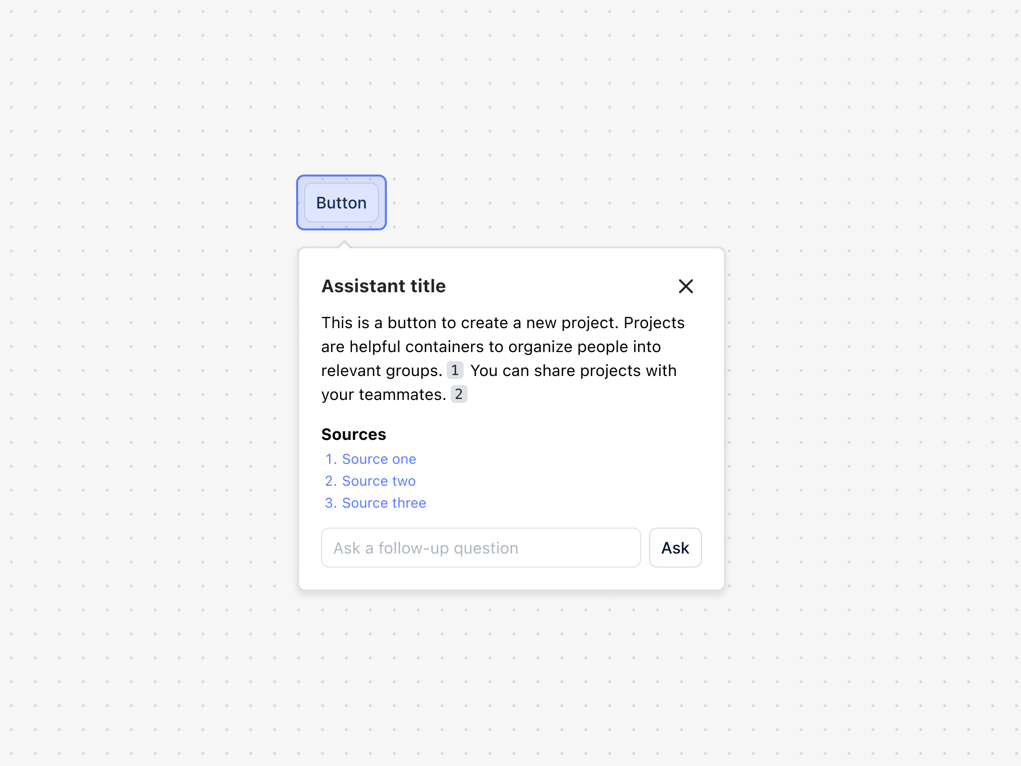
Having initialized the contextual assistant, you can now render UI that activates it (e.g. a button in the example that renders the provider popover).
In the example below, the popover renders with loading states, answer, sources, and an input where follow-up questions can be asked. All of these elements are composable and can be removed if unwanted. Likewise, they can be replaced with your own implementations.
import ContextualAssistant, {
  useContextualAssistant,
} from '@dopt/react-contextual-assistant';

function MyContextualAssistant() {
  const {
    close,
    selection,
    setActive,
    answer,
    content,
    documents,
    submittedQuery,
    enteredQuery,
    canSubmitQuery,
    onEnteredQuery,
    submitQuery,
  } = useContextualAssistant();

  return (
    <>
      <button onClick={() => setActive((prev) => !prev)}>
        Activate AI assistant
      </button>
      {selection && (
        <ContextualAssistant.Popover
          position="right"
          alignment="start"
          anchor={selection}
        >
          <ContextualAssistant.Content>
            <ContextualAssistant.Header>
              <ContextualAssistant.Title>
                ✨ AI assistant
              </ContextualAssistant.Title>
              <ContextualAssistant.DismissIcon
                onClick={() => closeAssistant()}
              />
            </ContextualAssistant.Header>
            <ContextualAssistant.Body>
              {answer || content ? (
                <ContextualAssistant.Answer>
                  {answer || content}
                </ContextualAssistant.Answer>
              ) : (
                <div style={{ display: 'grid', gap: 8 }}>
                  <ContextualAssistant.Skeleton />
                  <ContextualAssistant.Skeleton width="85%" />
                  <ContextualAssistant.Skeleton width="95%" />
                </div>
              )}
              {documents && documents.length > 0 && (
                <>
                  <ContextualAssistant.BodyHeading>
                    Sources
                  </ContextualAssistant.BodyHeading>
                  <ContextualAssistant.Sources>
                    {documents.map(({ url, title, id }) => (
                      <ContextualAssistant.Source key={id} url={url} index={id}>
                        {title}
                      </ContextualAssistant.Source>
                    ))}
                  </ContextualAssistant.Sources>
                </>
              )}
            </ContextualAssistant.Body>
            <ContextualAssistant.Question
              canSubmitQuery={canSubmitQuery}
              onEnteredQuery={onEnteredQuery}
              submitQuery={submitQuery}
            >
              {enteredQuery}
            </ContextualAssistant.Question>
          </ContextualAssistant.Content>
        </ContextualAssistant.Popover>
      )}
    </>
  );
}
Props
Provider
The root element of the contextual asssitant. Provider the sub-components the necessary context.
| Name | Type | Description |
|---|---|---|
| defaultActive? | boolean | Determines the initial visibility of the component (default: false) |
| assistant? | string | The Assistant in Dopt this contextual assistant is associated with |
| children? | ReactNode | The contents of the component |
| theme? | Theme | A theme definition to attach to the component |
Highlight
The highlight on hover interaction model for the contextual assistant. Attaches an absolutely positioned element to the body of the DOM.
| Name | Type | Description |
|---|---|---|
| scope? | window \| string \| HTMLElement \| React.RefObject<HTMLElement> | How to scope the highlights on the page. Defaults to 'window'. |
| selectors? | string[] | An array of css selectors used to determine which elements on the page can be highlighted. Defaults to ['*']. |
| children? | ReactNode | The contents of the component |
| theme? | Theme | A theme definition to attach to the component |
Popover
The contextual assistant popover. Extends HTMLDivElement.
| Name | Type | Description |
|---|---|---|
| alignment? | Alignment | Determines how the component should align relative to the anchor element (default: center) |
| children? | ReactNode | The contents of the component |
| offset? | number | The distance in px to position the component relative to the anchor element (default: 10) |
| position? | Side | The side that the component should position relative to the anchor element (default: top) |
| theme? | Theme | A theme definition to attach to the component |
Content
The contextual assistant popover's content. Extends HTMLDivElement.
| Name | Type | Description |
|---|---|---|
| children? | ReactNode | The contents of the component |
| theme? | Theme | A theme definition to attach to the component |
Header
The header of The contextual assistant popover. Extends HTMLElement.
| Name | Type | Description |
|---|---|---|
| children? | ReactNode | The contents of the component |
| theme? | Theme | A theme definition to attach to the component |
Title
The title of the contextual assistant popover. Extends HTMLHeadingElement.
| Name | Type | Description |
|---|---|---|
| children? | ReactNode | The contents of the component |
| theme? | Theme | A theme definition to attach to the component |
DismissIcon
The dismiss icon of the contextual assistant popover. Extends HTMLButtonElement.
| Name | Type | Description |
|---|---|---|
| theme? | Theme | A theme definition to attach to the component |
Body
The body of the contextual assistant popover. Extends HTMLDivElement.
| Name | Type | Description |
|---|---|---|
| children? | ReactNode | The contents of the component |
| theme? | Theme | A theme definition to attach to the component |
BodyHeading
The body heading of the contextual assistant popover. Extends HTMLDivElement.
| Name | Type | Description |
|---|---|---|
| children? | ReactNode | The contents of the component |
| theme? | Theme | A theme definition to attach to the component |
Skeleton
The loading component of the contextual assistant popover. Extends HTMLDivElement.
| Name | Type | Description |
|---|---|---|
| width? | CSSProperties['width'] | The width of the element |
| height? | CSSProperties['height'] | The height of the element |
| theme? | Theme | A theme definition to attach to the component |
Answer
The answer of the contextual assistant popover. Extends HTMLDivElement.
| Name | Type | Description |
|---|---|---|
| children? | string \| null | The markdown contents of the component |
| theme? | Theme | A theme definition to attach to the component |
Sources
The document sources of the contextual assistant popover. Extends HTMLDivElement.
| Name | Type | Description |
|---|---|---|
| children? | ReactNode | The contents of the component |
| theme? | Theme | A theme definition to attach to the component |
Source
A document source of the contextual assistant popover. Extends HTMLDivElement.
| Name | Type | Description |
|---|---|---|
| url? | string | The source url |
| index? | number | A key given this is an element in a rendered collection |
| children? | ReactNode | The contents of the component |
| theme? | Theme | A theme definition to attach to the component |
Question
The input where users can ask follow-up questions. Extends HTMLDivElement.
If users should not have the ability to ask follow-up questions, this component can simply not be used.
| Name | Type | Description |
|---|---|---|
| children? | string \| null | The current typed follow-up question. |
| placeholder? | string | A placeholder to show if no question is entered. Defaults to "Ask a follow-up question". |
| canSubmitQuery | boolean | A boolean which controls if users can send their question. This boolean controls the toggle and pressing "Enter". |
| submitQuery | () => void | A function which is called when users submit their question. |
| onEnteredQuery | (enteredQuery: string) => void; | a function which is called when users type in their question. |
| theme? | Theme | A theme definition to attach to the component |
Styling API
Learn more about styling and theming →
| Name | Selector | Description |
|---|---|---|
| popover | .dopt-contextual-assistant__popover | Popover element |
| content | .dopt-contextual-assistant__content | Content container |
| header | .dopt-contextual-assistant__header | Header containing title and dismiss icon |
| title | .dopt-contextual-assistant__title | Title heading |
| dismissIcon | .dopt-contextual-assistant__dismiss-icon | Dismiss icon button |
| body | .dopt-contextual-assistant__body | Body content |
| bodyHeading | .dopt-contextual-assistant__body-heading | Body heading |
| skeleton | .dopt-contextual-assistant__skeleton | Loading skeleton |
| answer | .dopt-contextual-assistant__answer | Text answer from AI API |
| sources | .dopt-contextual-assistant__sources | Collection of sources matching query |
| source | .dopt-contextual-assistant__source | Individual source matching query |
| source | .dopt-contextual-assistant__source-link-index | Index of source matching query |
| source | .dopt-contextual-assistant__source-link-metadata-title | Title of source matching query |
| source | .dopt-contextual-assistant__source-link-metadata-url | URL of source matching query |
| question | .dopt-contextual-assistant__question | Follow-up question element |
| question input | .dopt-contextual-assistant__question-input | Follow-up question input |
| question button | .dopt-contextual-assistant__question-button | Follow-up question button |