Hints
Overview
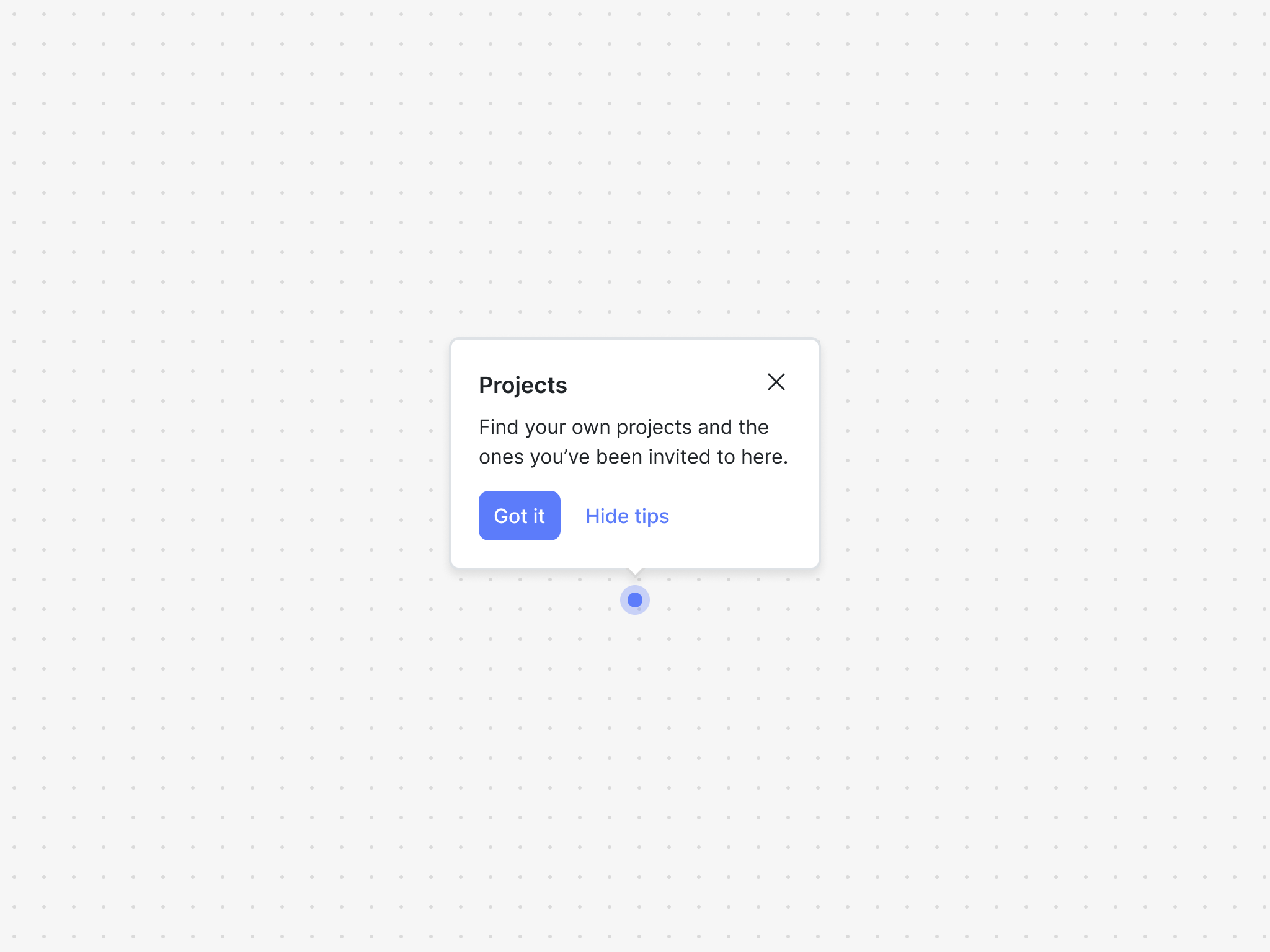
The hints component is powered by a hints block and is great way to call attetnion to UI elements to help users discover new features, provide contextual help, or nudge them towards a good next step.
A hints block is comprised of items, which are the unordered set of hints.
The hints component exposes two hooks and a family of UI components to easily build product hints or hotspots.
Installation
If you are using a particular React framework like Next.js, please check out our framework specific docs.
- npm
- Yarn
- pnpm
npm install @dopt/react-hints
yarn add @dopt/react-hints
pnpm add @dopt/react-hints
Usage
The default export from @dopt/react-hints is a collection of components that you can use to structure and compose a hints item.
import Hint, { useHintsItem } from '@dopt/react-hints';

function MyHintsStep({ children }) {
  const hintItem = useHintsItem('hints.project-creation');

  if (!hintItem) {
    return children;
  }

  return (
    <Hint.Root active={hintItem.active}>
      <Hint.Anchor>
        <button style={{ position: 'relative' }}>
          Create a project
          <Hint.Indicator
            onClick={() => hintItem.setOpen(!hintItem.open)}
            style={{
              bottom: -8,
              right: -8,
            }}
          />
        </button>
      </Hint.Anchor>
      <Hint.Popover position="bottom" open={hintItem.open}>
        <Hint.Content>
          <Hint.Header>
            <Hint.Title>{hintItem.title}</Hint.Title>
            <Hint.CloseIcon onClick={() => hintItem.setOpen(false)} />
          </Hint.Header>
          <Hint.Body>{hintItem.body}</Hint.Body>
          <Hint.Footer>
            <Hint.CompleteButton onClick={hintItem.complete}>
              {hintItem.completeLabel}
            </Hint.CompleteButton>
            <Hint.DismissAllButton>
              {hintItem.dismissAllLabel}
            </Hint.DismissAllButton>
          </Hint.Footer>
        </Hint.Content>
      </Hint.Popover>
    </Hint.Root>
  );
}
Check out our hints example and our headless hints example for more in-depth usage.
Props
Root
The root element of the hints item.
| Name | Type | Description |
|---|---|---|
| active? | boolean | Determines the visibility of the component (default: false) |
| children? | ReactNode | The contents of the component |
| theme? | Theme | A theme definition to attach to the component |
Anchor
The element to anchor the hints item to.
| Name | Type | Description |
|---|---|---|
| children | ReactElement | A React element to anchor to |
Indicator
The indicator element, typically contained within the anchor. Extends HTMLSpanElement.
| Name | Type | Description |
|---|---|---|
| onClick? | () => void | A handler for click that can be used to show the hint popover. Note that any event handler can be used here. |
| animate? | boolean | Control over whether the indicator is animated. Defaults to true. |
| style? | React.CSSProperties | Style object for custom positioning of the indicator |
Popover
The hints item popover. Extends HTMLDivElement.
| Name | Type | Description |
|---|---|---|
| alignment? | Alignment | Determines how the component should align relative to the anchor element (default: center) |
| children? | ReactNode | The contents of the component |
| open? | boolean | A boolean determining whether the hint popover is open |
| offset? | number | The distance in px to position the component relative to the anchor element (default: 10) |
| position? | Side | The side that the component should position relative to the anchor element (default: top) |
| theme? | Theme | A theme definition to attach to the component |
Content
The content of the hints item popover. Extends HTMLDivElement.
| Name | Type | Description |
|---|---|---|
| children? | ReactNode | The contents of the component |
| theme? | Theme | A theme definition to attach to the component |
Header
The header of the hints item popover. Extends HTMLElement.
| Name | Type | Description |
|---|---|---|
| children? | ReactNode | The contents of the component |
| theme? | Theme | A theme definition to attach to the component |
Title
The title of the hints item popover. Extends HTMLHeadingElement.
| Name | Type | Description |
|---|---|---|
| children? | ReactNode | The contents of the component |
| theme? | Theme | A theme definition to attach to the component |
Content
The content of the hints item popover. Extends HTMLDivElement.
| Name | Type | Description |
|---|---|---|
| children? | ReactNode | The contents of the component |
| theme? | Theme | A theme definition to attach to the component |
DismissIcon
The dismiss icon of the hints item popover. Extends HTMLButtonElement.
| Name | Type | Description |
|---|---|---|
| theme? | Theme | A theme definition to attach to the component |
Body
The body of the hints item popover. Extends HTMLDivElement.
| Name | Type | Description |
|---|---|---|
| children? | RichText | The rich text contents of the component |
| theme? | Theme | A theme definition to attach to the component |
Footer
The footer of the hints item popover. Extends HTMLElement.
| Name | Type | Description |
|---|---|---|
| children? | ReactNode | The contents of the component |
| theme? | Theme | A theme definition to attach to the component |
CompleteButton
The back button of the hints item popover. Extends HTMLButtonElement.
| Name | Type | Description |
|---|---|---|
| children? | ReactNode | The contents of the component |
| theme? | Theme | A theme definition to attach to the component |
DismissAllButton
The next button of the hints item popover. Extends HTMLButtonElement.
| Name | Type | Description |
|---|---|---|
| children? | ReactNode | The contents of the component |
| theme? | Theme | A theme definition to attach to the component |
Styling API
Learn more about styling and theming →
| Name | Selector | Description |
|---|---|---|
| popover | .dopt-hints-item | Popover element |
| indicator | .dopt-hints-item__indicator | Hint indicator |
| content | .dopt-hints-item__content | Content container |
| header | .dopt-hints-item__header | Header containing title and dismiss icon |
| title | .dopt-hints-item__title | Title heading |
| dismissIcon | .dopt-hints-item__dismiss-icon | Disiss icon button |
| body | .dopt-hints-item__body | Body content |
| footer | .dopt-hints-item__footer | Footer containing back and next buttons |
| completeButton | .dopt-hints-item__complete-button | Complete button |
| dismissAllButton | .dopt-hints-item__dismiss-all-button | Dismiss all button |
Popover position
| Name | Selector | Description |
|---|---|---|
| top | .dopt-hints-item--top | Positioned top |
| top | [data-position="top"] | Positioned top |
| right | .dopt-hints-item--right | Positioned right |
| right | [data-position="right"] | Positioned right |
| bottom | .dopt-hints-item--bottom | Positioned bottom |
| bottom | [data-position="bottom"] | Positioned bottom |
| left | .dopt-hints-item--left | Positioned left |
| left | [data-position="left"] | Positioned left |
Popover alignment
| Name | Selector | Description |
|---|---|---|
| start | .dopt-hints-item--start | Aligned start |
| start | [data-alignment="start"] | Aligned start |
| center | .dopt-hints-item--center | Aligned center |
| center | [data-alignment="center"] | Aligned center |
| end | .dopt-hints-item--end | Aligned end |
| end | [data-alignment="end"] | Aligned end |
Headless hooks
If you are planning to only use the hints headlessly, you can import the hooks alone using @dopt/react-hints/hooks.
useHints
- useHints(
id: string): Hints
A React hook for accessing and updating a hints's state.
import { useHints } from '@dopt/react-hints';

export function MyHintsStep() {
  const {
    id,
    items,
    active,
    completed,
    dismissed,
    complete,
    dismiss,
    filter,
    count,
    size,
  } = useHints('onboarding-hints.hints-component');

  return (
    <div>
      <div id="states">
        <div>hints.active: {active}</div>
        <div>hints.completed: {completed}</div>
        <div>hints.dismissed: {dismissed}</div>
      </div>
      <div id="actions">
        <button onClick={complete}>Complete</button>
        <button onClick={dismiss}>Dismiss</button>
      </div>
      <div id="children">
        hints.items: {items.map((item) => item.id).join(' ')}
      </div>
      <div id="filtering">
        <div id="active-items">
          {filter('active')
            .map((item) => item.id)
            .join(' ')}
        </div>
        <div id="not-active-items">
          {filter('not-active')
            .map((item) => item.id)
            .join(' ')}
        </div>
        <div id="completed-items">
          {filter('completed')
            .map((item) => item.id)
            .join(' ')}
        </div>
        <div id="not-completed-items">
          {filter('not-completed')
            .map((item) => item.id)
            .join(' ')}
        </div>
        <div id="dismissed-items">
          {filter('dismissed')
            .map((item) => item.id)
            .join(' ')}
        </div>
        <div id="not-dismissed-items">
          {filter('not-dismissed')
            .map((item) => item.id)
            .join(' ')}
        </div>
        <div id="done-items">
          {filter('done')
            .map((item) => item.id)
            .join(' ')}
        </div>
        <div id="not-done-items">
          {filter('not-done')
            .map((item) => item.id)
            .join(' ')}
        </div>
      </div>
      <div id="metadata">
        <div>hints.size: {size}</div>
      </div>
    </div>
  );
}
useHintsItem
- useHintsItem(
id): HintsItem
A React hook for accessing and updating a hints item's state and content.
import { useHintsItem } from '@dopt/react-hints';
import RichText from '@dopt/react-rich-text';

export function Application() {
  const {
    id,
    hints,
    title,
    body,
    completeLabel,
    dismissAllLabel,
    active,
    completed,
    dismissed,
    next,
    back,
  } = useHintsItem('onboarding-hints.step-1');

  return (
    <div>
      <div id="states">
        <div>hintsItem.active: {active}</div>
        <div>hintsItem.completed: {completed}</div>
        <div>hintsItem.dismissed: {dismissed}</div>
      </div>
      <div id="actions">
        <button onClick={next}>{completeLabel}</button>
        <button onClick={back}>{dismissAllLabel}</button>
      </div>
      <div id="content">
        <div>hintsItem.title: {title}</div>
        <div>
          hintsItem.body: <RichText>{body}</RichText>
        </div>
        <div>hintsItem.completeLabel: {completeLabel}</div>
        <div>hintsItem.dismissAllLabel: {dismissAllLabel}</div>
      </div>
      <div id="parent">
        <div>hintsItem.hints: {hints?.id}</div>
      </div>
    </div>
  );
}
Types
Hints
A stateful container for hints items.
interface Hints {
  id: string;

  items: HintsItem[];

  active: boolean;

  completed: boolean;
  dismissed: boolean;

  field: <V>(name: string) => undefined | null | V;

  complete: () => void;
  dismiss: () => void;

  size: number;

  filter(on: FilterableField): HintsItem[];
  count(where: CountableField): number;
}
HintsItem
A child of the hints. Includes state accessors and methods for updating state along with content configured in Dopt.
interface HintsItem {
  id: string;

  hints: Hints | undefined;

  index: number | null | undefined;

  title: string | null | undefined;
  body: RichText | null | undefined;

  completeLabel: string | null | undefined;
  dismissAllLabel: string | null | undefined;

  active: boolean;

  completed: boolean;
  dismissed: boolean;

  field: <V>(name: string) => undefined | null | V;

  complete: () => void;
  dismiss: () => void;
}
FilterableField
type FilterableField = 'completed' | 'not-completed' | 'dismissed' | 'not-dismissed' | 'active' | 'not-active' | 'done' | 'not-done';
CountableField
type CountableField = FilterableField;
Alignment
type Alignment = 'start' | 'center' | 'end';
Position
type Side = 'top' | 'right' | 'bottom' | 'left';